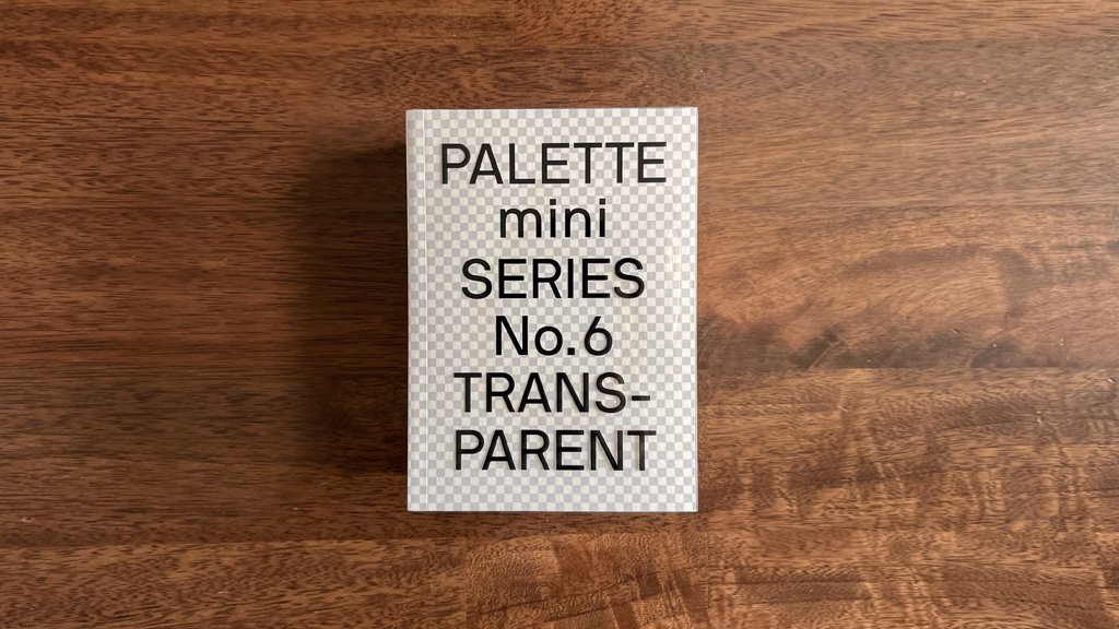
Happy to received a new book from victionary! <PALETTE mini series No.6 Transparent> showcases over 130 select works that demonstrate how transparency can be interpreted in creative new ways. Our work Enigma catalogues (winter) was selected again in their book. Thank you so much : )
CHARACTER OF PIE-PIE-CHOR

Recently, we are designing a logo and character(s) for a new brand.
Stay tuned for our design process and goodies coming up very soon!
NEW NAME CARD FOR KSANA
We just designed a new name card for Ksana!
Please contact us to get it!

OUR NEW WEBSITE
Finally, a new update to our site!
SUPERFINE

Mohawk Superfine is the finest printing paper made today. It is famous in its outstanding reputation for quality and consistency. We was invited by Tai Tak Takeo Fine Paper to share the ‘superfine’ idea in their new tiny booklet SUPER DEFINED which for the Mohawk Superfine promotion campaign.
Read more: https://www.facebook.com/ttf.com.hk/posts/891619854363535
BOOKLET DESIGN FOR T · PARK
Our new project collaborated with Environmental Protection Department. We completed the booklet design for T · PARK opening in June 2016.
T · PARK is a world-class sludge treatment facility in Nim Wan of Tuen Mun, Hong Kong. Designed by renowned French architect Claude Vasconi. The streamlined and wave form design was inspired by the surrounding sea and hills.
The concept behind T · PARK is simple and clear: a facility that transforms ‘waste-to-energy’. It combines a variety of advanced technologies with recreational,educational and ecological features in a single complex. It points the way to more sustainable future in Hong Kong, and sets high standards for green practices in building design.
The booklet design is inspired by the T · PARK logo (designed by Milkxhake). We tried to apply the wave forms in different combination in each chapter. The wave form proportion and shape are based on the logo and it is the characteristic of the architecture. The different combination of wave form is representing the possibility of ‘waste-to-energy’.
Booklet design: Ksana Design Studio
Naming and visual identity: Milkxhake

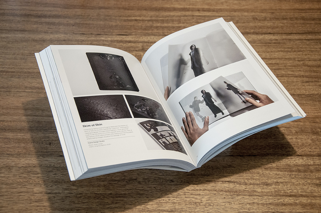
SKIM OF SKIN IN PALETTE NO.6: TRANSPARENT
Our long time ago project Skim of Skin has been featured in Viction:ary’s new book - PALETTE No.6: Transparent.
Transparency is a powerful attribute in design, carrying a personality that can be as glaring as hues. It extends and limits vision, spawns a sense of presence and absence and conceals and reveals content, luring viewers into exploring what lies beneath and beyond. Whether it is a tangible element or a conceptual idea that deceives the eyes, it is this beguiling layer that can make all the difference.
More details at www.victionary.com

WHO DID IT \ CHAI-WA-WA

Our work was selected by WHO DID IT again.
This is the identity of CHAI-WA-WA.
Read more: http://whodidit.jp/2014/07/29105248.php
ENIGMA CATALOGUE WAS SELECTED BY FPO
FPO is a blog dedicated to the visual stimulus and the detailing of the development and production of printed matte: Annual reports, books, business cards, stationery suites, collateral materials, posters, packaging and anything else where ink meets substrate. We are so happy that our work: Enigma 2011 FW Catalogue - Skim of Skin was selected by FPO. The post is included our feeling and
the reviewers comment. Thank you Kelly. Thank you Enigma give us a chance to join this project.
Read more: http://www.underconsideration.com/fpo/archives/2013/01/enigma-catalogue-incomplete.php

WHO DID IT \ STYLEKIKI
Our work was selected by WHO DID IT again.
This is the name card design of Stylekiki.
Read more: http://whodidit.jp/2013/01/25143939.php

NEWWEBPICK INTERVIEW
Topong was invited by NEWWEBPICK to have an interview last month. The interview will be published in NewWebPick e-zine Issue 41 and it had been released. Now, we would like to share the interview content below, thank you NewWebPick and Danny's invitation.
Tell us a little bit about your background?
I am a native graphic designer whom born and raised in Hong Kong. I begin my interest in studying web and graphic design many years ago. After graduating from the college, I continued my studying on graphic design at Caritas Bianchi College of Careers and achieved an Gold Key award. As school finished, I worked in some small design studios in Hong Kong for some years. One day, I felt stuck, I felt that I was just too little, I had not seen enough to make me a better designer, I realized I really need to learn and feel more with my own eyes and hands, and to gain experiences on every chance I have come into. Hence, I decided to set up my own design studio, together with Ricky, my senior friend from school as my partner. I really thank Ricky for all his supports.
Who are your main inspirations? / What are your influences?
I do not like trapping myself inside the studio for long hours. In order to get inspirations, I love to go out, to see more, and to see what is happening around me, around the world. One of the benefits having my own studio is that I do not need to limit my work styles due to company’s rules, I do not have to limit myself at any time to go out for inspirations. Although I am not physically siting in the studio all day long, I know very well and am good at allocate time, meeting deadlines etc. I will and I can ensure every single work is to be done at a specific time on a specific date. I am proud to share with you that my time management skill is definitely a plus besides graphic design.
How do you keep motivated and interested?
Sources of inspirations are from all around. There are always designs around us, things we see, we touch, we feel can become the source of inspirations.
KenyaHara from Japan and Hung Lam from Hong Kong are my favorite designers, their design philosophy and values have affected me a lot, also, my computer teacher back in the college also moved me a lot, he encouraged me to do what I am good at and to really enjoy in it, if this is not him who encourage me, I might not go for graphic design, but in business administration.
I love hanging around in the bookstores, reading increase my sensitivities to the world, to things happening around. I often say I got fully charged after sinking myself in the design books, and often impulse me to return to the studio immediately to start my design. Recently, I also browse onto some design sites to search for different types of design from other parts of the world to
broader my perspectives.
Do you have any new projects coming up that you can tell us about?
We do have several brand design projects on discussion process now, wish us luck.
What do you know about your country’s design/designers?
There are quite a numbers of excellent designers in Hong Kong. KAN Tai Keung is one I inspired the most, Tommy Lee, Eddy Yu, Hung Lam, Benny Luk, Javin Mo and Henry Chu are also my respected designers.
Any words you would like to pass it to new comer designers?
Ask yourself if you really enjoy in designs, if you really like it and enjoy doing it, I believe you will find a way of your own. Modesty and sense of responsibility is absolutely are must. In my opinion, modesty is the strongest weapon as you continue to progress, while responsibility, include your own concept of time, the education of customers and your respect for the design, to at least do not be late, and do not participate in unpaid bidding and plagiarism etc.
I ponder consider that design can be a slow progress, no one expects you to start to be a master, but if you have a wrong state of mind, it will be so difficult to step your way back.
Any final comments?
KSANA is still growing, we are not yet a very outstanding studio, but we are always improving and trying to climb up to the top. We will keep exploding ideas and enthusiasm on our designs to make better and more powerful work! Thank you again for NEWWEBPICK to give us this opportunity to let the world to know about KSANA.
Please go to the NewWebPick to download the lite ver. or buy the full ver. to read the full content: http://ezine.newwebpick.com

DID OF THE DAY \ TWO THOUSAND TWELVE

Our Calendar - TWO THOUSAND TWELVE just got the "Did of the day" in WHO DID IT.
Read more: http://whodidit.jp/2012/02/23101308.php